Well, we're so nearly at the end. As we all frantically try to organise our final presentations, finish our models and delve into the dangers of printing I wish good luck to all.
As [probably] the penultimate post of the year, here is my sectional perspective drawing. As with the visuals, this is hand drawn and then Photoshopped. I've based this on the section submitted in my Tech Report, there are a few things I'd like to still tweak on this, but it's 95% there.
Friday, 15 May 2009
Friday, 8 May 2009
Visuals
When thinking about how I represent this building in three dimensions I decided to try several different ways. I've used sketches and models throughout the design process, with little 3d computer modelling. I wanted to try and do something I've not done so much of in the past so rather than 3d renderings have opted for a large physical model and a series of sketches/drawings to explain the site and proposal.
The image below shows the crèche, which is adjacent to the main entrance of the school. Hand drawing is not my greatest strength, so I've gone for the clean line drawing with photoshopped textures, shadows etc. Although it doesn't instantly come across as being hand drawn, I'm happy with the outcome and intend to use this to produce a few more visuals as well as a sectional perspective.
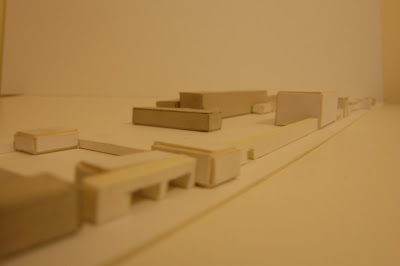
The image at the bottom is a photo of my physical model, taken on my phone so apologies for the poor quality. I just have a few dozen trees to make and then it'll be done.
As always, I'm interested in any comments you may have.
Thursday, 7 May 2009
Preparing the final presentation
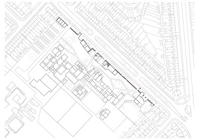
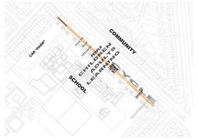
It's been a while since my last update and I've been very busy. I just wanted to update with some development images I'm preparing for the final presentation, hopefully to get some feedback. These will be the first three images of the presentation, showing the location plan and the concept behind the proposal, I won't explain them too much as hopefully they'll tell you what you need to know.
Any thoughts or comments gladly welcome.
Monday, 13 April 2009
12 Reasons to Refuse to Render?
Interesting article on the Young Architect blog on why architect's should refuse to do CG renderings, head over there and check it out.
Do you think it's a good point about knowing more about 3D software than [the more useful?] CAD programmes? Personally, I feel I'm more in tune with CAD (albeit it Microstation) than I am with 3D rendering; I prefer to use it sparingly nowadays. I'll certainly be using it for my final presentation; I think it's a very strong tool for representing spaces, particularly if you feel (like me) that whilst your hand-drawing is good for sketching and developing ideas it does not have the sophistication to turn them into presentation images.
It's a good point about leaving these things to the professionals too, it is, after all, what they're there for. I agree with the response to the article that suggests we try and be 'jacks of all trades and masters of none.' We don't necessarily have to be good at rendering/3d modelling to be good architects.
Tuesday, 24 March 2009
The Independent's "50 Great Ideas for the 21st Century"
I came across this whilst researching sheep's wool insulation (in at number 29) and there are some fantastic ideas on this list.
50 Great Ideas for the 21st Century.
Saturday, 21 March 2009
Library Building - Developing the Architectural Language
Myself and Ed had a meeting with Steve yesterday which proved very useful and an important step in the project. Steve had us pin up drawings at the scale we aim to present them and it soon became clear where there were gaps in the design, for example certain areas of the site plan were more define than others and the main school entrance seemed insignificant. Besides tweaking the floor plans and site plan, the elevations needed a bit of re-thinking, particularly the elibrary elevation facing the school.
This is what I pinned up and presented to Steve:
This was directly developed from the model that I have previously posted images of and the general consensus was that there was no unified architectural language, there are three or four different styles forming and it makes the elevation untidy. The vertical timber boarding had promise but the differing window heights, horizontal boarding and most of all the 'Swiss Lodge' overhanging eaves to the entrance just don't work.
So, I revisited this and have developed a more uniform language, one I'm still working on but am substantially more happy with.. I have taken the vertical boarding and laid them in 250mm wide elements, the windows are now all the same height and the widths are all a multiple of 250mm (thanks for that idea Ed!); they have also been recessed 100m and give extended openings above and below. The roof has been made completely flat, with parapets and green roofs throughout. The colours have been toned down to become softer, pastel shades.
The two options below show one with vertical timber boards (top) and the other with the timber painted in 10 different colours (plus white) to create a pattern.
Personally, I find the elevation with the timber boards to be the more successful; the coloured boards seems disjointed and perhaps too overwhelming considering that this will face the school.
I'd be interested to hear what people have to say regarding these, any preference?
Thursday, 12 March 2009
Facade refurbishment
Following my earlier post, here's an image which shows a first attempt at updating the school elevation which fronts the street and wall.
The majority of the building has been re-clad in vertically laid willow reeds, with the windows being made much smaller. The stair elements have been rendered white (the one shown connects to the new library building) and the new classrooms on the ground floor have been given a simple rendered finish, using the colour palette adopted elsewhere.
I'm not entirely convinced by this at the minute, I like the simplicity of it, I don't think it requires a complex resolution. It may just be that this drawing doesn't quite do it justice or perhaps I need to play with the proportions of the windows etc.
Existing building re-furbishment
As part of my project I am proposing a refurbishment of the existing school; this will be on a strategic level (i.e. proposing change of use, re-decorating) but one element that I am looking at in more detail is the external fabric.
As the above photo shows, it's currently a typically unpleasant 60's school building, enveloped by glass and blue concrete panels. From experience I know that classes on the South face (to the street and the new wall) are cold, due to the large expanses of glazing, and that the classrooms on the North side overheat drastically. The same treatment is used all the way around the building and I am planning to propose a solution to these problems. The way to do this is to propose alternative façade treatments for North and South facing elevations.
Looking for some options I found this school refurbishment in Schulzendorf:
Like a basket, the new façade is woven from willow reeds; this got me thinking. As part of my proposal I am removing two fairly large willow trees from the site, I could use these to create the new façade (or as much as it would cover, I guess around 50%). The South elevation could be very similar to the Schulzendorf school but with the inclusion of more colour, particularly where the re-furbished classrooms on the ground floor protrude. The South façade requires a little more thinking about, there needs to be solar shading incorporated. This could either be as canopies or woven (literally?!) into the cladding system. The diagrams below explore some of the options:
The North elevation facing Bricknell Avenue and the new wall:
Options for the South façade:
The image below shows an option using coloured panels rather than willow, which is an option for both elevations. The panels are curved in various forms to overhang the window openings to create the shading.
Considering the options, I think the willow panels may be the best option, for aesthetic and susainable reasons. I think the first skecth, showing a simple solution to the North elevation with a more playful element to the South elevation (with the curves to create shading) is the best way forward..
I've not been able to find much out about willow as a cladding material, so if anyone has any links or suggestions please let me know.
Sunday, 8 March 2009
Celebrating 90 years of the Bauhaus
Enjoy this 2 part article about the Bauhaus, which is 90 years old this year.
Celebrating 90 Years of Bauhaus
Thursday, 5 March 2009
Book Review: A Whole New Mind: Why Right-brainers Will Rule the Future by Daniel Pink
Something new for the blog, a book review; I'm not particularly one for reviewing books, especially in writing but I enjoyed this one so much I thought I should recommend it.
I came across Daniel Pink's book whilst looking for some books regarding well-being particularly in relation to community and economy. I started it three nights ago and by lunch time today had finished it (excessive train travels helps!), having been completely engrossed by it. Without wanting to spend too much time reviewing the book I'll outline the ideas that run through it.
Pink starts by introducing a historical narrative of the progression of human society through 4 main 'ages':
Pink offers 6 'senses' through which to deal with these new challenges:
From a personal perspective, it seems obvious to me that these 6 'senses' identify exactly what we're trying to achieve in the Grad Dip course and especially in our thesis projects. It certainly helped to focus my thoughts.
Anyway, a late night review cannot do this book enough justice; whether a creative type or not I fully recommend getting yourself a copy of this book, it may not change your life but it might just help it.
I came across Daniel Pink's book whilst looking for some books regarding well-being particularly in relation to community and economy. I started it three nights ago and by lunch time today had finished it (excessive train travels helps!), having been completely engrossed by it. Without wanting to spend too much time reviewing the book I'll outline the ideas that run through it.
Pink starts by introducing a historical narrative of the progression of human society through 4 main 'ages':
- Agricultural Age (farmers)
- Industrial Age (factory workers)
- Information Age (knowledge workers)
- Conceptual Age (creators and empathisers)
- Can someone overseas do it cheaper? Outsourcing of jobs to Asia, particularly India and China.
- Is what I'm offering in demand in an age of abundance? Our society has never been wealthier and more in possession of material goods.
- Can a computer do it faster?
Pink offers 6 'senses' through which to deal with these new challenges:
- Design - Moving beyond function to engage the sense.
- Story - Narrative added to products and services - not just argument. Best of the six senses.
- Symphony - Adding invention and big picture thinking (not just detail focus).
- Empathy - Going beyond logic and engaging emotion and intuition.
- Play - Bringing humour and light-heartedness to business and products.
- Meaning - Immaterial feelings and values of products.
From a personal perspective, it seems obvious to me that these 6 'senses' identify exactly what we're trying to achieve in the Grad Dip course and especially in our thesis projects. It certainly helped to focus my thoughts.
Anyway, a late night review cannot do this book enough justice; whether a creative type or not I fully recommend getting yourself a copy of this book, it may not change your life but it might just help it.
Developing the Architectural Language
Whilst tech. week has been happening I've been busy progressing the scheme in more detail. The plan below shows the latest revision of the site plan, I've labelled the different functions which are plugged into the wall and have also identified the external spaces (in shades of green), all of which are to have a different purpose (i.e. main entrance to the school, allotments, fruit trees, etc.); two key axis which need more reinforcement (in purple) and an example of a transition space (in yellow). This transition space could be a change in material, colour, smell, noise, level or anything, but this is a prime opportunity to amplify the difference between different spaces.
I have spent a considerable amount of time developing the library/cafe building; this forms the main building of the proposal and is also where I will be focusing my technical aspects. Alongside developing the floor plans, elevations and sections (not yet to be shared!) I continue to work in models and sketches. The photos below show the latest model.
I heeded Steve's advice to inject some colour into the models and also to look more closely at individual elements. Colour is used to accentuate particular areas of and routes through the building.
Along with the green roofs and timber elements, I feel like I'm developing an eco-De Stijl language! Not a bad thing in my view.
Along with the technology developments there are still design issues to tackle, following a discussion with Steve:
- Thresholds - reduce the extremity between outside and inside spaces, as Pattern Language number 166-Gallery Surround which was previously identified.
- Transition spaces, as mentioned above.
- A response to the identified axis on the site plan.
- Continue to develop the library spaces; make the study 'pods' more intimate; integrate shelving into the fabic of the building, design the children's section.
- Some precedents to examine are: the work of Hugo Haring, a house in Devon which uses rammed earth, developed with the LEDA; Le Corbusier's proposals for the use of rammed earth in several buildings; the work, particularly drawings, of Peter Salter. (Further posts to update on these)
Tech Week Review
This week has been a designated 'Tech Week' for the whole year; a chance to discuss the construction, details and mechanical & engineering aspects of my project. Below I have outlined some of the points I discussed with the 3 tutors (along with Martin and Yussef):
Glen McGowan, construction & overview:
- As part of the concept of 'Well-Being' it is important that the technology and strategies employed in this building reflect that. This means using natural materials as much as possible; 80-90% of natural (or from natural) materials creates a more harmonious relationship between building, user and environment and should therefore be the ambition of my technical studies.
- The [natural] materials of the building may well be dictated by their ability to allow for passive ventilation, solar heating etc. For example a certain timber cladding structure may encourage better natural ventilation than others.
- Would green walls to the street help to break the monolithic nature of the wall? Possibly, but then it's North facing so may not actually be suitable for green walls.
- Maybe used rammed earht for the wall.
- I should consider using pre-fabricated systems (i.e. SIPS) as much as possible.
- How are voids and variation in wall/ceiling thickness constructed?
- If I intend to have green roofs throughout, I need to detail how the supporting timber frame is constructed.
- Generally, a straightforward scheme to develop. Single storey aspects require no mechanical extract or cooling. All needs to be heated.
- The library, cafe and kitchen building will need local mechanical extracts.
- Heating to be from a new district heating system (i.e. biomass boiler) that fulfills the energy requirement for not only my scheme but the existing school and 6th form perhaps?
- Buildings to have radiators or under-floor heating?
- Case of building up strategically from the foundations.
- There has been no previous development on the site and along with the low building height, this means I can use a shallow [pad?] foundation.
- If I use rammed earth I need to eradicate erosion/vandalism problems.
- Glulam beams to be used for the 3-storey main building frame. The detail into the rammed earth wall would be necessary. Junctions in steel could be very elegant.
- The cantilvered media suite needs columns to support it.
Tuesday, 24 February 2009
Cafe / Library Model
The joint cafe and library building poses one of the biggest challenges of my proposal. It is the main building in this building complex and is likely to be significantly higher than other aspects of the wall, possibly matching the existing school building in scale. So I need to spend a good amount of time developing it and today I feel I made significant progress in making a further model of the building. Below are the images with some annotation. I've dropped some people in to give a sense of the scale to the model.
This is the West Elevation, showing the kitchen on the ground floor (with green roof) and the reading/study area of the library on the third floor.
Finally, this is the East Elevation and the main entrance to the building. You can see the core to the left of the photograph and the double height entrance space adjacent. Within the entrance space there will be a stair directly up to the library, mirroring the external stair. The relationship between the two is a chance to play with levels, windows and light to create some interesting events.
Aerial photograph. Note the extensively planted green roofs, the large open areas to the South and the cores to both ends which provide stair access/escape and toilets. The main entrance is to the right of the photograph, with an external and internal stair leading up to the library on the second floors.
View from Bricknell Avenue, showing the building set back above the wall. Openings in the wall are deep to this elevation to provide intimate seating areas in the public cafe on the ground floor. There is a large green wall here, helping to break up the elevation.
South Elevation as seen from the existing school building.This is the West Elevation, showing the kitchen on the ground floor (with green roof) and the reading/study area of the library on the third floor.
Finally, this is the East Elevation and the main entrance to the building. You can see the core to the left of the photograph and the double height entrance space adjacent. Within the entrance space there will be a stair directly up to the library, mirroring the external stair. The relationship between the two is a chance to play with levels, windows and light to create some interesting events.
Site Model
Here are some quick photos of the site model I made last week. This shows the new wall sitting forward of the existing school building and the approximate scale of the new buildings.
Scale: 1:500
Scale: 1:500
Thursday, 19 February 2009
Proposed site plan and development
So, this is my first revision of my proposed site plan, with the wall to the North East edge of the site.
There is also a 1:500 model of this, which I'll upload some photos of soon.
I presented these to Steve, Ed and Rick on Tuesday as part of our usual usual morning session and the feedback was positive, here are some points which came out of those discussions to allow me to develop this further:
There is also a 1:500 model of this, which I'll upload some photos of soon.
I presented these to Steve, Ed and Rick on Tuesday as part of our usual usual morning session and the feedback was positive, here are some points which came out of those discussions to allow me to develop this further:
- The sections of the wall that curve around tree positions are exciting, can these incidental interventions be used elsewhere to express other parts of the wall?
- How close to the tress can I actually build? I've based my workings on the spread of the canopy, but Ed's Landscape Architect friend offered a definitive solution - If there is a Tree Protection Order then there is no chance of building a wall. For other trees I need to measure the diameter of the trunk 1.5m up from the ground and multiply that by 10 for a single trunk or by 12 for a multi-stem tree. Thanks for that very useful piece of information. I need to add this information to my site plan and amend accordingly.
- The individual sections of the wall (library, creche, etc.) and external spaces need to now be developed ahead of our Tech. Week (w/c 2nd March). The library and creche are, I feel, the most important elements of the proposal and what I will likely concentrate on for my Technology Report, therefore I need to quickly finalise the other areas to allow me to concentrate fully on these. I need to take a side-step and re-introduce the Pattern Language again.
- The construction/materials of the wall are crucial to the success of the building. Steve suggested something colourful may be the answer and I am to look at solutions for this. Tuesday's post on the Ordino Complex is one example, Ed suggested glazed bricks which could be a colourful and low maintenance solution. There is of course, the work of Gaudi to look at, particularly the Park Guell.
- The external spaces seem to split themselves up into 5 zones. In order from North to South they are: Car "Park", external Art/Performance space, new pedestrian entrance/transition zone, an as of yet undefined 'Something in the Middle' area and finally the garden allotments area. These need to be worked out to create 'Positive Outdoor Space'. I need to look at the 'kitchen gardens' of stately homes for an idea on how my garden area may work and also consider placing greenhouses throughout the site, possibly against the wall, to create a connection between the other areas and the, slightly disconnected, gardens and shop.
- Do I need a lift in the creche, despite it only being two storeys high?
- How does the school connect to the library, if it does at all? I think that maybe covered walkways directly from the school's existing staircases, at all levels, could be an exciting solution. I need to explore this further.
- The entrance in to the library and creche courtyard and the main entrance is very important, it is the propylaea of the project and as such needs to be an exciting space.
- There are school bus stops to Bricknell Avenue, can these be incorporated into the wall and made exciting places to wait?
- I had a colour co-ordinated image showing the use of existing schools, Steve thinks I should explore this further to incorporate my proposal. He suggest I look at the drawings of Portuguese architect Tomas Taveira.
- I need to have a proposal for the refurbishment of the existing school building, if only in diagrammatic form. The work of DRMM should give me some pointers. The refurbishment of the old school sports hall into a lecture hall, for example, is too extensive to undertake in this project but there need to be strategies in place.
Tuesday, 17 February 2009
Ordino Complex / Arteks Arquitectura
Courtesy of www.archdaily.com
I think this is a really interesting project and following some discussions tody athere are some elements that are useful as a precedent for my project.
Here's the blurb:
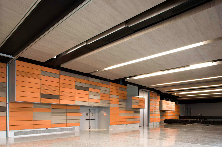
What I find particularly interesting and relevant is this internal wall which is supposed to create the sensation of exterior space inside.
The materials of the wall element of my project need to be very carefully chosen, they need to express a new architectural language whilst harmonising with the school building and the surrounding houses. Using coloured panels could be an interesting solution to creating the wall, different coloured panels could be used to express seperate elements of the wall and buildings.
I think this is a really interesting project and following some discussions tody athere are some elements that are useful as a precedent for my project.
Here's the blurb:
Architect: ARTEKS Arquitectura + Esther Pascal architect
Location: Ordino, Andorra, Spain
Architects in charge: Gerard Veciana Membrado & Elisabet Faura Pavia
Collaborators: Gemma Roca, Dalila Pregal, Alvaro Briceño, Malte Ruckert, Ruper Maurus, Carlos Cobreros, Cecilia Vázquez
Artistic Collaborator: Victor Pérez Porro
Technical Architect: Alex Miralles
Structure: GETCE BEAL_ Xavier Beal Vilaginés
Utilities: Bernabé Rodriguez
Acoustics: Higini Arau
General Contractor: COIMA S.A
Utilities: Bernabé Rodriguez
Constructed Area: 9,714 sqm
Photographs: Pedro Pegenaute & Eugeni Pons
The puiet complex is a building composed by four different programmatical activities. Because of its dimension, complexity, trying to obtain a better-scaled relationship with the urban context of the town of Ordino, and adapting itself to the different existent typologies, the volume of the building has been fragmented following its different activities. Differentiating roofs, materials and façade depths.
What I find particularly interesting and relevant is this internal wall which is supposed to create the sensation of exterior space inside.
The materials of the wall element of my project need to be very carefully chosen, they need to express a new architectural language whilst harmonising with the school building and the surrounding houses. Using coloured panels could be an interesting solution to creating the wall, different coloured panels could be used to express seperate elements of the wall and buildings.
Monday, 16 February 2009
Well Being Wall?
Been a while since I've updated here so I'll try to condense two weeks into a fairly short paragraph.
As I began to look in more detail at what my Community 'Well-Being' Centre should be it came up in discussions that with 2 monolithic buildings on the site, was proposing a 3rd entirely appropriate? This also came up in developing the 'Pattern Language', which promotes the use of a 'Building Complex' rather than one large building. This lead to a few days of playing with ideas based on a building complex until eventually the following idea was hit upon
:
Could a building complex occupy the whole of the North East site boundary, creating a wall? Could the previously identified notions of 'Well Being' be inserted to create a 'Well Being Wall'?
Friday, 30 January 2009
Narrative
Narrative is an important tool in developing the design. By imagining how a person, or group, may use the building I can begin to make decisions on the design, be that through the location of a particular activity or space or on smaller details such as the placement of windows to capture views.
Below are three narratives produced as part of my booklet:
Case Study - Sharp Centre for Design, Toronto by Alsop Architects, 2004
I've previously looked at Peckham Library as a case study, Steve has suggested that I also look at this building by Alsops also. Although struggling to find something to back up what I recall Alsop saying about this building (during a lecture he gave which I attended a few years back) I recall that it is built on stilts, above the existing building, to preserve the views to the adjacent park. There may also be some issues regarding rights and space requirements which were unachievable at ground level.
Anyway, a very useful article from www.galinsky.com has this to say about the building:
The Sharp Centre for Design was built to accommodate an expansion of the Ontario College of Art & Design in downtown Toronto. The project was funded by the College, the Province of Ontario, and Rosalie and Isadore Sharp - the benefactors after whom the building is named. The building houses new art studios, lecture theaters, exhibit spaces, and faculty offices. It is the first building completed in North America by the English architect Will Alsop.
The center is a two-story, black and white rectangular volume set atop brightly colored, 26 meter tall columns, straddling existing buildings of the College. In addition to this most visible part of the building, an unbuilt space between existing buildings was filled, creating space for new functions while providing the elevator and stair core that services the upper levels. Located on a quiet side street between two main commercial streets, its immediate neighbors include midrise housing, a food court, the Art Gallery of Ontario, the Gardiner Museum of Ceramic Art (temporary location), and Grange Park, a treed community park immediately south of the Art Gallery of Ontario. From Grange Park the black and white volume creates a delightful edge as it hovers on its stilts.
With the addition of the Sharp Centre for Design at the Ontario College of Art and Design, Will Alsop cleverly addresses the complicated notion of expansion in a dense urban setting with his soaring black and white box. The building stitches a connection between existing buildings while providing new space in the rectangular volume that proudly soars above. Organizing the rectangular block above the site allows the street level to become what promises to be a new and valuable civic space that can become an extension of the activities of the college. Still the building may be criticized for being somewhat exclusive, failing to offer a serious connection to the street. However regardless of this consideration one cannot help but believe that there is room in Toronto for this type of assertive expression.
Provocative, unconventional, hopeful, whimsical, and perhaps irreverent, the building is remarkable in the context of Toronto. As a winner of a 2004 RIBA Worldwide Award, the building was described as "courageous, bold and just a little insane." Alsop's project seems perfectly fitting for a college of art and design in a city criticized for competent, but ordinary, architecture. Interestingly, what we see is far less wild than the scheme originally envisaged by Alsop - early representations show the rectangular volume dressed in a dizzying array of day-glow colors. In this light, the simple pre-finished metal cladding seems somehow consequential, and perhaps a hint to difficulties involved in achieving such an unconventional building. Above all, the building may be considered optimistic, and hopefully sets a course for the students who will occupy it.
I also found these images of the models, which I think are really interesting. They are not immaculately made but have a real quality about them which explains the thinking behind the design as well as giving an impression of the impact it may have.
Click here to see a 3D model of the building.
Reviews
On Tuesday myself, Ed and Rick had an interim review with Bob following our usual meeting with Steve in the morning. There were some interesting points to come out of these discussions and Steve's feedback on my document so far:
- My booklet contained information and the initial development of 'A Pattern Language', as developed by Christopher Alexander, but discussions with Bob brought up some potential problems. This methodology has been around for a couple of decades (in fact Bob knows it very well as he studied it as a student!) and has never really taken off as a major method of design. I have to question whether it's entirely relevant, although my thoughts are that it is extremely interesting and is something I'd like to give a modern interpretation. There is a risk that it becomes a formulaic pattern for the components of the design; it would be down to my own creative intuition to prevent that.
- 'Well Being' has many strands of meaning, therefore it is necessary to examine what it might mean in relation to spirituality, noise and light for example.
- Bernard Tschumi, in Architecture & Disjunction, says about "... the actions and events that take place within the social and political realm of architecture." and that in "...contemporary urban society, any cause-and-effect relationship between form, use and function, and socio-economic structure has become both impossible and obsolete." He argues that architecture has become a means to stabilise and institutionalise society, meaning architecture has become "the artful building of spaces" rather than responding to events or program. I'm still getting to grips with his writings but I think he's suggesting that architecture should be about the program of events and activities. This may not necessarily mean that one building is sufficient for many activities and that it requires each to be considered and developed in the most relevant manner. Here's the trusted Wikipedia comments on Tschumi:
[His] approach unfolded along two lines in his architectural practice: first, by exposing the conventionally defined connections between architectural sequences and the spaces, programs, and movement which produce and reiterate these sequences; and second, by inventing new associations between space and the events that 'take place' within it through processes of defamiliarization, de-structuring, superimposition, and cross programming.
If anyone has read Tschumi or has any thoughts, I'd be delighted if you would leave some comments.
- Does the school site need something tall, a beacon? Could this be a clock tower or similar?
- Is it really relevant to develop the grassed area and hard sports surface as I am currently intending to? Would it make more sense to develop on the school forecourt, maybe over the existing area even? I should examine dual use of the existing school building. Are there facilities there that are capable of taking some of the activities of my proposal? The land to the South-East of the site may be better utilised for growing food, etc.
Thursday, 8 January 2009
Project Update
I'm currently working up a (roughly) 5000 word document investigating the context and underlining thought processes of my proposal. This will include an understanding of the social environment in which the site exists and theory which supports the decision to create a community building in this location as well as case studies and initial design development.
I've been supporting my writing through numerous books and writings, including Christopher Day's Places of the Soul, C. Richard Hatch's The Scope of Social Architecture and Jack Rostron's Sick Building Syndrome.
I'm sure I'll update the blog as the document and project evolve but there's currently too much to post without boring people to tears, so I'll offer the following which defines what 'Community Well Being' might be and at the bottom a quote which I find interesting from C. Richard Hatch's book.
The dictionary definition of ‘Well Being’ as a state of comfort, health and happiness suitably sums up the ambitions of this project, albeit expanded so as to integrate a whole community rather than being individually focused. ‘Well Being’ can refer to the activities taking place in the building as well as the building itself, well designed, considerate architecture is essential in this process.
I've been supporting my writing through numerous books and writings, including Christopher Day's Places of the Soul, C. Richard Hatch's The Scope of Social Architecture and Jack Rostron's Sick Building Syndrome.
I'm sure I'll update the blog as the document and project evolve but there's currently too much to post without boring people to tears, so I'll offer the following which defines what 'Community Well Being' might be and at the bottom a quote which I find interesting from C. Richard Hatch's book.
well-being: n. the state of being comfortable, healthy or happy
community: n. (pl. communities) 1. a group of people living together in one place 2. (the community) society 3. a group of people with a common religion, race of profession: the scientific community 4. the holding of attitudes or interests in common 5. a group of animals or plants living or growing in the same place. Origin: Old French comunete
community care: n. long-term care for mentally-ill, elderly and disabled people within the community rather than in hospitals or institutions.
community centre: n. a place providing educational or recretational activities for a neighbourhood.
community service: n. socially useful work that an offender is required to do instead of going to prison.
The dictionary definition of ‘Well Being’ as a state of comfort, health and happiness suitably sums up the ambitions of this project, albeit expanded so as to integrate a whole community rather than being individually focused. ‘Well Being’ can refer to the activities taking place in the building as well as the building itself, well designed, considerate architecture is essential in this process.
“Society has been fragmented into “interests” that are the unavoidable effect of a competitive market in labor. Community is almost unknown; society is reduced to an aggregation of fearful and mutually suspicious individuals.”
Subscribe to:
Posts (Atom)